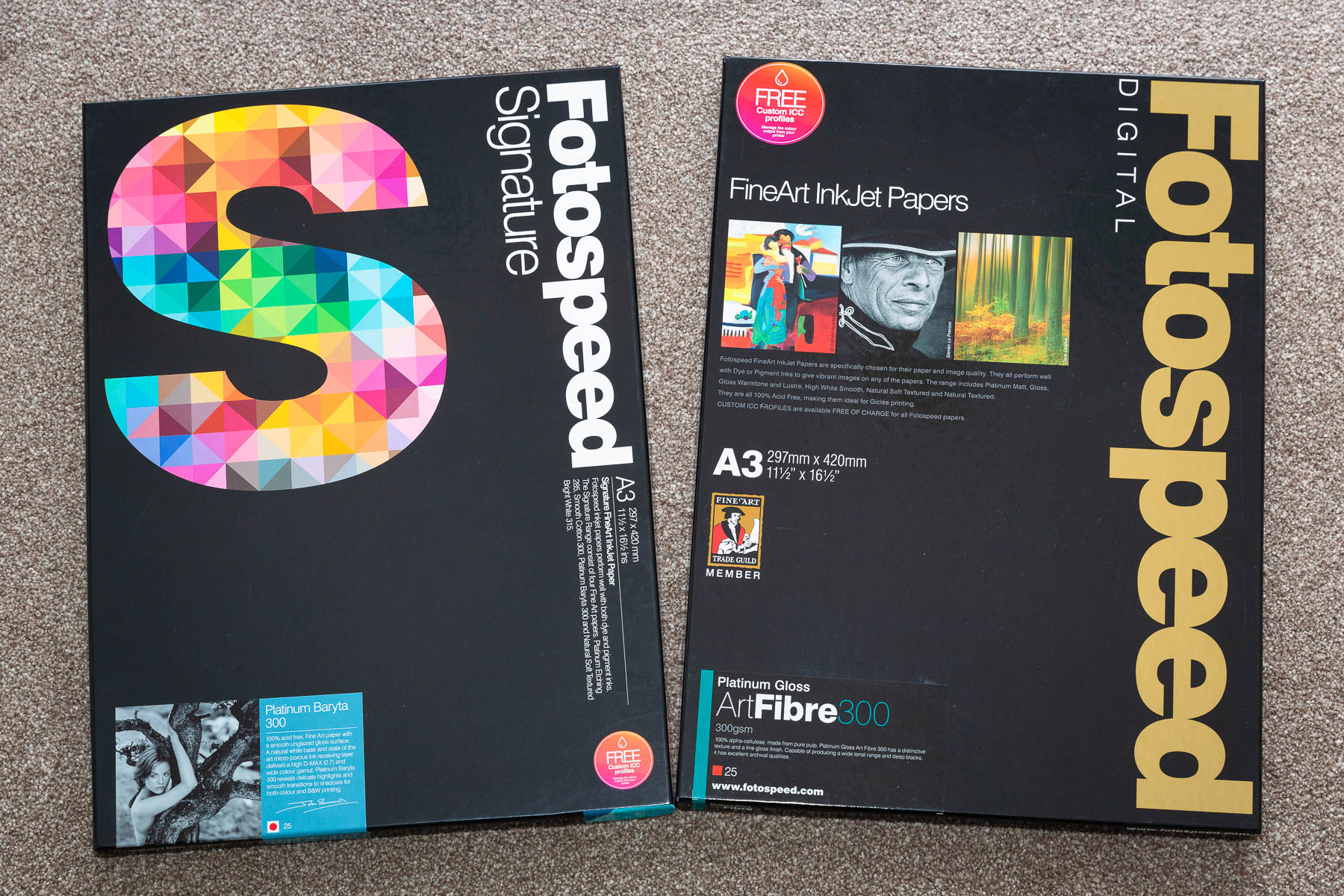
The festive season usually brings an increase in printing so I was delighted when Fotospeed got in touch asking if I’d like to review some paper from their ‘Signature’ range. I’ve long been a user of Fotospeed’s Pigment Friendly Lustre 275 and Photo Smooth Pearl 290 papers for those everyday prints, but for the ‘fine art’ images that I exhibit or sell I’ve tended to use Hahnemuhle’s paper range with a fondness for PhotoRag Baryta.

I opted to try two papers I figured would suit my tastes – Platinum Baryta 300 and Platinum Gloss Art Fibre 300. Here’s a brief description from Fotospeed:
Platinum Baryta 300 is 100% acid-free, Fine Art paper with a smooth unglazed gloss surface. A natural white base and state of the art micro-porous ink receiving layer delivers a high D-MAX (2.7) and wide colour gamut.
Platinum Gloss Art Fibre 300 is made from 100% alpha-cellulose pulp, a heavyweight exhibition quality paper, and is protected against environmental influence, so prints will last for decades. The paper’s archival quality makes it ideal for photographers who want to create long-lasting images, while its glossy finish and tonal range makes it a good choice for those who don’t want to lose detail when shooting in bright conditions.
Testing the paper – the nuts and bolts
I used a Canon Pro 100 printer which takes 8 dye-based inks. It might not be top of the range or use the more acclaimed pigment-based inks, but it’s proved to be a good workhorse for quick and relatively affordable printing.
One of the nice options from Fotospeed is the ability to get a free custom ICC printer profile. In my opinion this is worth doing as I have found an improvement in replicating what I see on my monitor to what comes out of the printer. Fotospeed offer a step by step ‘How to’ guide and once you’re printed the test chart you simply post it and they email back a custom profile which you install to your computer.
Images were printed at 12×8 inches on A3 paper from Lightroom, using the custom paper profile and Intent: Perceptual at a print resolution of 240ppi.
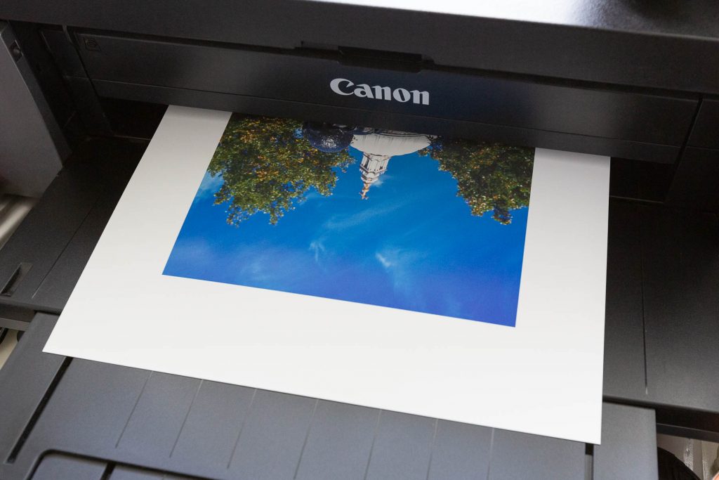
So with profiles installed and paper loaded I was ready to rock and roll! But what to print…
The print – black and white
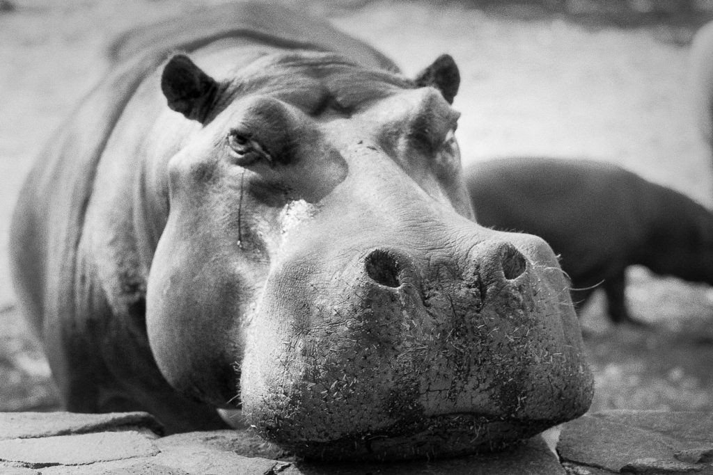
I started with a black and white image first. The hippo was taken in South Africa on Ilford Delta 100 film using a Leica MP and 35mm Summicron. It was developed in Rodinal 1 + 25 for 9 mins. It has tons of sharp texture in the snout and falls off with rolling grey tones and that ever present Rodinal grain bringing texture and interest to the flatter parts of the image.
I started with the Platinum Baryta 300 paper. First impressions when I picked it off the printer, the paper felt gorgeously weighty yet flexible like traditional resin coated photo paper, and with a slightly cold feel, it was as if I’d pulled it straight from the developing tray. I almost expected liquid to drip off!
My hippo looked exactly like the image on screen. It was sharp, where the sharp bits are. The grain was lovely and grainy. The transitions in the tones were smooth and the blacks were deep yet still retained detail where detail existed. The Baryta has a slightly warmer tone which you don’t necessarily notice until you compare it to the whiter Platinum Gloss Art Fibre. When holding it up to the light it has a pleasing slightly stippled sheen which leans towards a smooth gloss finish but nowhere near the over the top reflectiveness that turns me right off gloss papers.
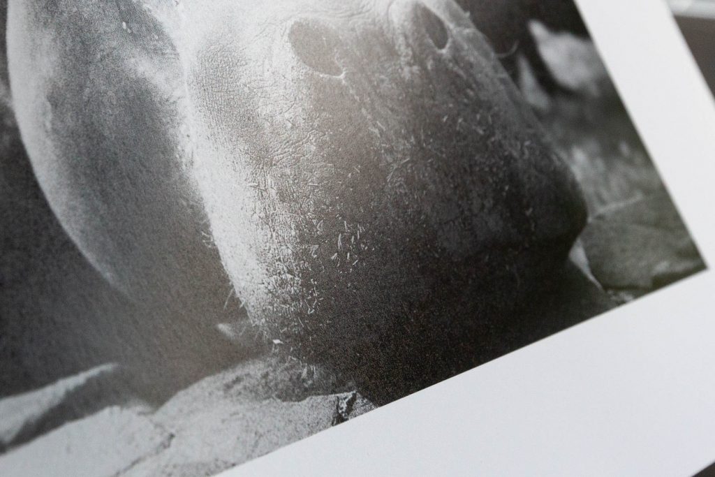
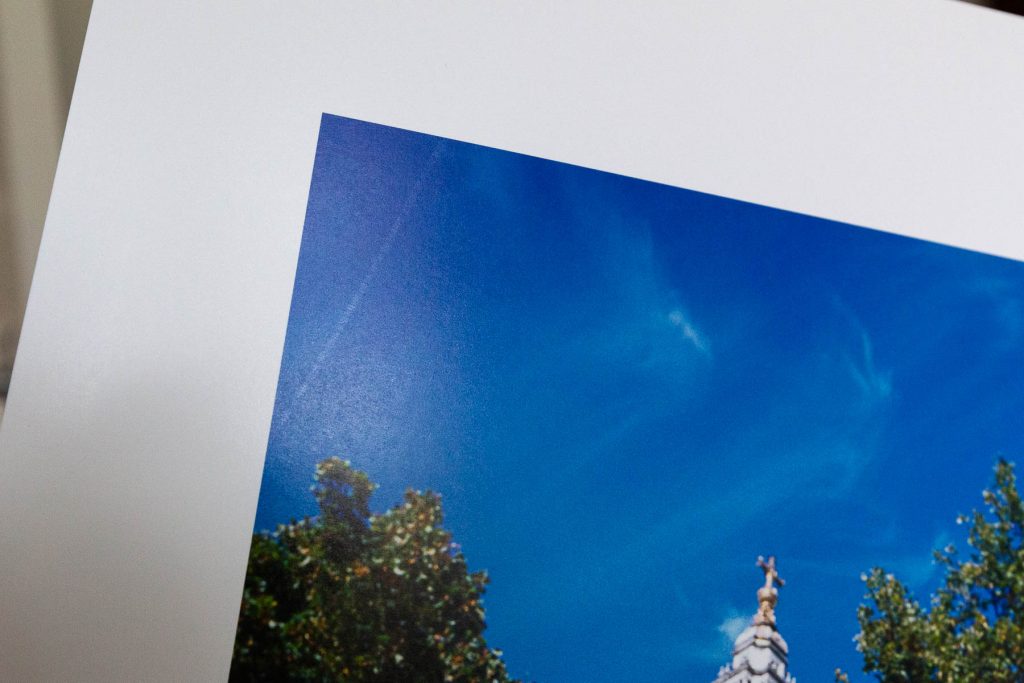
Platinum Baryta 300 close up showing sheen and stipple
Next, I printed the same image on the Platinum Gloss Art Fibre paper. It has the same 300gsm weight to it but feels more paper like than photograph. That said the surface still has that slight photo sheen to it just with a bit of texture. Like the Platinum Baryta, the same image characteristics were all there – smooth tonal transitions, lovely grain and sharpness, deep blacks that still retained detail.
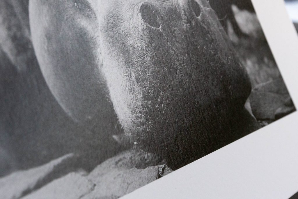
Platinum Gloss Fibre Art 300 close up showing sheen and texture
Side by side comparison
When comparing them side by side it looks to my eyes that the Platinum Gloss Art Fibre has slightly greater contrast and so appears sharper. In fact, it really pops. The blacks seem a little darker yet the same details still show through. The Baryta has that slight air of vintage about it. A warmer embrace, like a fine wine, trilby hats and 30’s music – there’s something classic. The Platinum Gloss on the other hand, feels more like a hit of double expresso, a gentle slap in the face with “Anarchy in the UK” playing in the background…
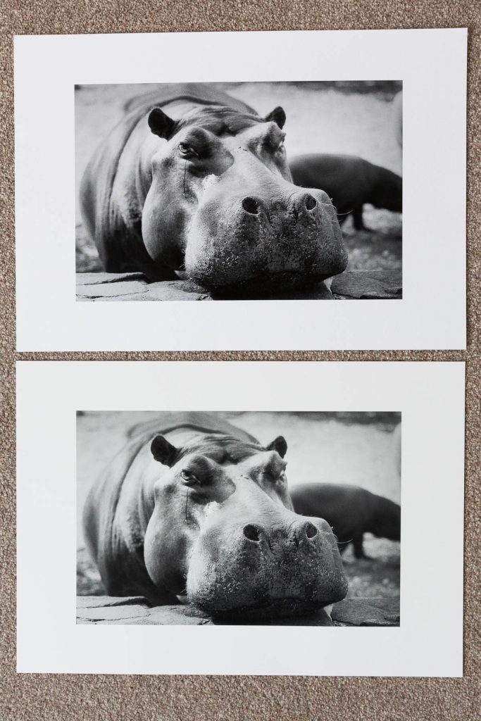
Top print is Platinum Gloss Art Fibre 300, lower print is Platinum Baryta 300
Compared to Hahnemuhle Photo Rag Baryta
So how’s it compare to the Hahnemuhle Photo Rag Baryta I’ve been using lately? Well, this paper is heavier at 315gsm. It feels more matt like to touch, but then it’s a cotton based paper. The surface sheen is a little glossier than Fotospeed’s Baryta, but its texture is very similar to Platinum Gloss. It has an even warmer tone than Fotospeed Platinum Baryta looking almost sepia when held side by side. The blacks are darker and the details in the shadows aren’t as prominent, in some areas, like the Hippo’s lower mouth, detail has almost disappeared.
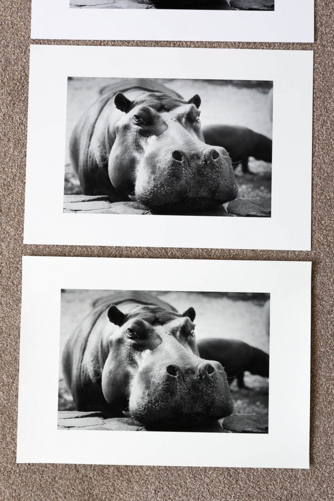
Top print is Fotospeed’s Platinum Baryta. Bottom print Hahnemuhle’s Photo Rag Baryta
As much as I like Hahnemuhle paper it has two big frustrations for me. Firstly, at 315gsm or 325gsm it often struggles to feed into the printer, and when it does I can get roller marks on the print surface. Secondly, the odd fibre will come off the paper after printing, and sods law this always happens in a dark section of the print so you end up with an obvious white dot mark. It’s expensive paper and then to waste an A3+ amount of ink, costs can add up very quickly!
On the Fotospeed paper front, so far so good! At 300gsm I have been able to feed it straight through from the top with no problems and no roller marks. That said I did notice on one sheet some kind of surface mark. I don’t think it came from my printer because it runs diagonally. Did it come out of the box like that? I’m not sure, but from now on I will be vigilant because it’s these minor imperfections that drive me nuts with home printing. Maybe I’m too fussy and by the time you get the print in a frame and look at it straight on you won’t notice. But I’d suggest if you were to print anything really critical check the paper surface first. I also hit it up with the rocket blower and in the case of Hahnemuhle paper an anti static cloth lightly wiped.
The prints – colour
Next up, to print some colour. Over the summer I tried my first roll of Kodak’s Ektachrome E100 (again using the Leica MP & 35mm Summicron). Wow, does it live up to what slide film is all about! Saturated colour to slap you in the face! I thought this image of George Ehrlich’s ‘Young Lovers’ sculpture in front of St Paul’s Cathedral would be a good choice with its deep blue sky, mix of greens and yellow and then deeper tones within the sculpture itself.
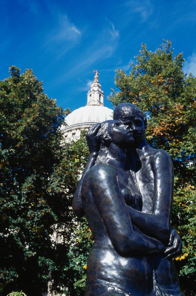
The first print was on Platinum Baryta 300. It didn’t disappoint! Colours were true to my on screen image and negative. Vibrant, deep, saturated screaming ‘Ektachrome’ very loudly. Exactly the same can be said for the print on Platinum Gloss Art Fibre paper. Only here the increased contrast is quite apparent when you compare them. There feels like a loss of detail in the shadows though the highlights still hold up very well and all the detail is present.
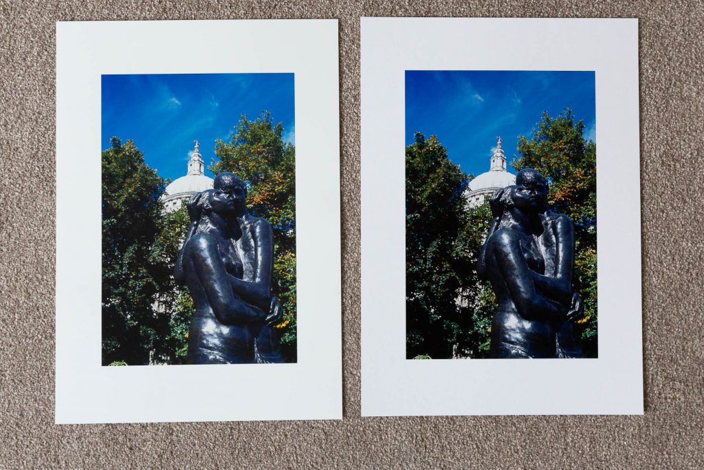
Left Platinum Baryta 300, right Platinum Floss Art Fibre 300
Is it fair to compare the papers? Probably not, I mean I use certain films because I want a certain look and the same can be said for paper choice. I’m glad I did compare however as its shown how different papers can influence how the image renders. I’d be keen to extend tests to other papers in the Fotospeed Signature range to see how they handle.
Conclusions
So, what are my conclusions? Well, I really like these papers. They have the look and feel of a high quality fine art paper. I would happily exhibit and sell my images using either one of them. They replicated well what I see on my computer screen and that gives me confidence when I’m retouching my images to know what I see is what I’m going to get when I hit ‘print’. Of course, learning that one displays a bit more contrast than the other is useful to know and I can use that to suit the subject or make minor adjustments if needed.
Black and white images printed very well on both papers. The range of tones from deep blacks through to white is lovely and I liked the classic feel the Baryta gave me even though I hadn’t realised it till I compared it with the Platinum Gloss.
Colour printing was equally good. I was really impressed with how it detailed the rich vivid Ektachrome slide film shot. I’ve also printed a few portraits and colours have produced very well. Skin tones look natural and are a fair reflection to what I see on screen. Platinum Gloss definitely gives more pop and colours are more saturated.
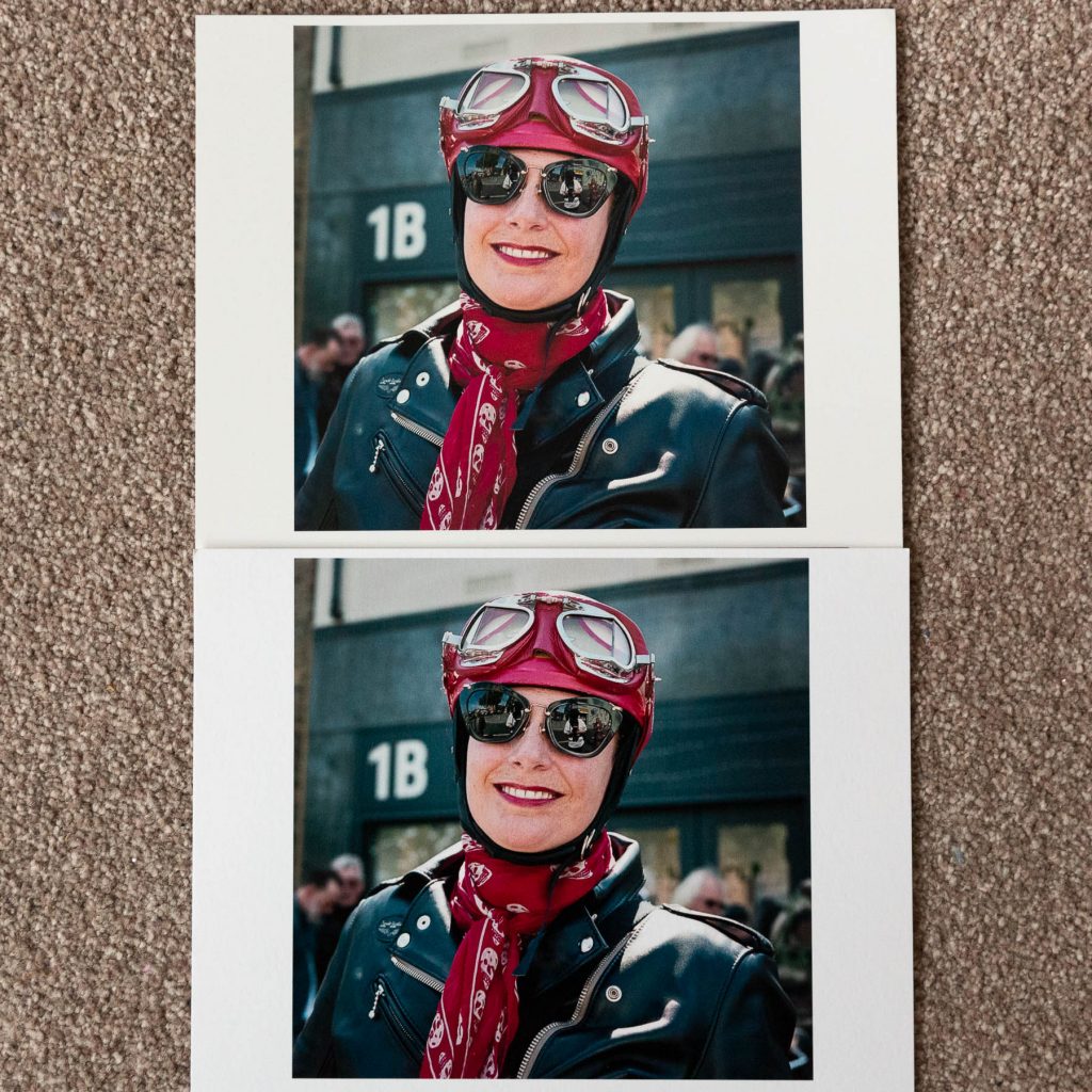
Top print is Platinum Baryta 300, bottom Platinum Gloss Art Fibre
More information about Fotospeed Fine Art Inkjet papers can be found at www.fotospeed.com
If you made it this far – thanks for reading! Do get in touch if you have any questions or would like to share your experience of inkjet printing.